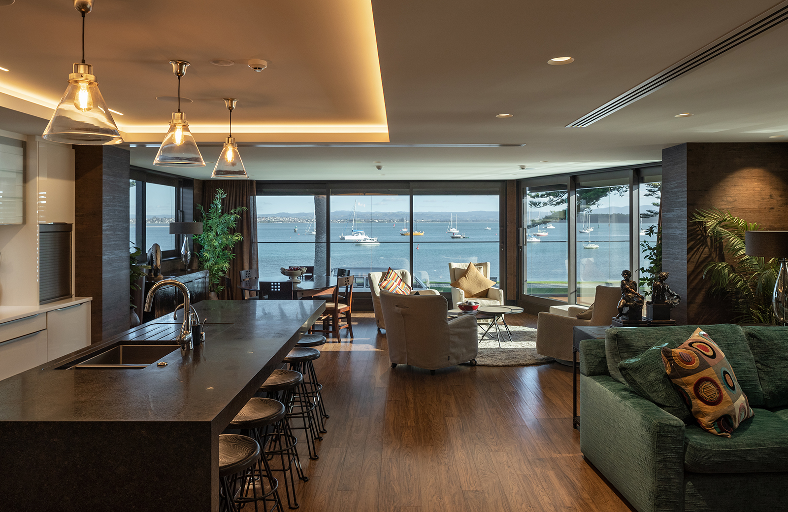
Many apartments have sprung up along Pilot Bay on the south facing side of Mount Maunganui peninsular, yet the architectural responses to the road-front sites all grapple with the same challenges: privacy, shelter, light and views.
It’s a common dilemma: the privilege of taking pride of place on the seafront also means exposure to the elements and neighbouring properties. Facing south, harnessing light and views are extra challenges.
The client’s brief was to develop this particular site into four apartments, with the ground floor for the land owners, the two apartments on the first floor for the client and elderly parents, and the penthouse to be sold to contribute to the development’s cost. Aesthetically, the client wanted a warmer and more engaging design than some of the more generic apartment responses on the street.
It wasn’t the simplest of briefs, yet the structured simplicity of DCA’s Darryl Church and Werner Naude’s solution belies a complicated technical response to a set of complex design parameters. Not only was the site archaeologically sensitive (meaning an archaeologist was present for excavation), but it’s also in a flood risk zone.
The site’s design was conceived of as a bund, with the building’s ground floor sitting below flood level and a storm-proof wall built around the site above the flood level, which acts as a barricade so the driveway access will rise to flood level and back down into the garage in the event of a springtide or storm surge. Additionally, a pump was installed to remove any on-site water.
With that taken care of, achieving a three-level building within the tight site and working within daylight planes were the next challenges. The resulting structural response resembles the tiers of a wedding cake, and yet in practice it was not as simple as stacking one layer on top of another. “There was a lot of structural gymnastics going on to line up each of the three floors, which don’t exactly sit on the floor below,” says Church.
The ground level is essentially a concrete podium, with the upper two levels designed as a steel superstructure that transfers eccentric loads from the recessing levels as they step up. It means the floor-to-floor spaces between are tight, with services redesigned to fit in the cavities. “The success of it is despite all these complexities and restrictions, you would never know or understand all the challenges that were involved – it doesn’t show on the outside.”
Interestingly, it was the challenge of achieving the maximum floor plates in the recessed, stepped structure, that meant most of the living and bedroom spaces were afforded their own external deck. But the decks needed a privacy solution so that occupants are screened from the road and neighbours. “One of the responses was to have active and dynamic screening and louvres on the south-east facing elevation. The automated external louvres control the amount of light coming in and the views from the apartment,” says Naude.
The large sliding shutters with operable louvres also run the entire length of the western façade, allowing occupants control over light and sun. At the southern end of the apartments louvres allow privacy for living spaces from the street. The louvres have the added benefit of softening the building’s façade, and their dynamic ability to adapt to the weather and light gives the apartments a sense of being alive and responsive to the coastal environment.
The exterior claddings and interior finishes also respond directly to the harsh coastal climate. High spec powder- coated aluminium weatherboards were selected for this reason, but in order to aesthetically soften external elevations they were chosen in a three-tone colour to bring warmth and depth to the façade, which further enhances the build’s organic qualities.
Aluminium composite panels and plaster claddings complement the three-tone weatherboards and the front fence draws the line of sight out towards the sea, softening the exterior aesthetic with wave-like steel fins cantilevered from the concrete plinth.
Inside the client wanted warmer materials, and the base design includes tactile elements such as natural clay render. Naude says the number of challenges throughout the design and build made the project special. “The biggest success for me was our ability to come up with solutions.” The immaculately finished detailing of the building with its bold, clean lines is a particular point of pride for designers and client.
“The clients were nothing short of perfectionists in terms of craftsmanship and level of finish,” says Church, and the finished product directly speaks to the attention to detail in every aspect of
the design.
Photography by Simon Devitt



.jpg)
