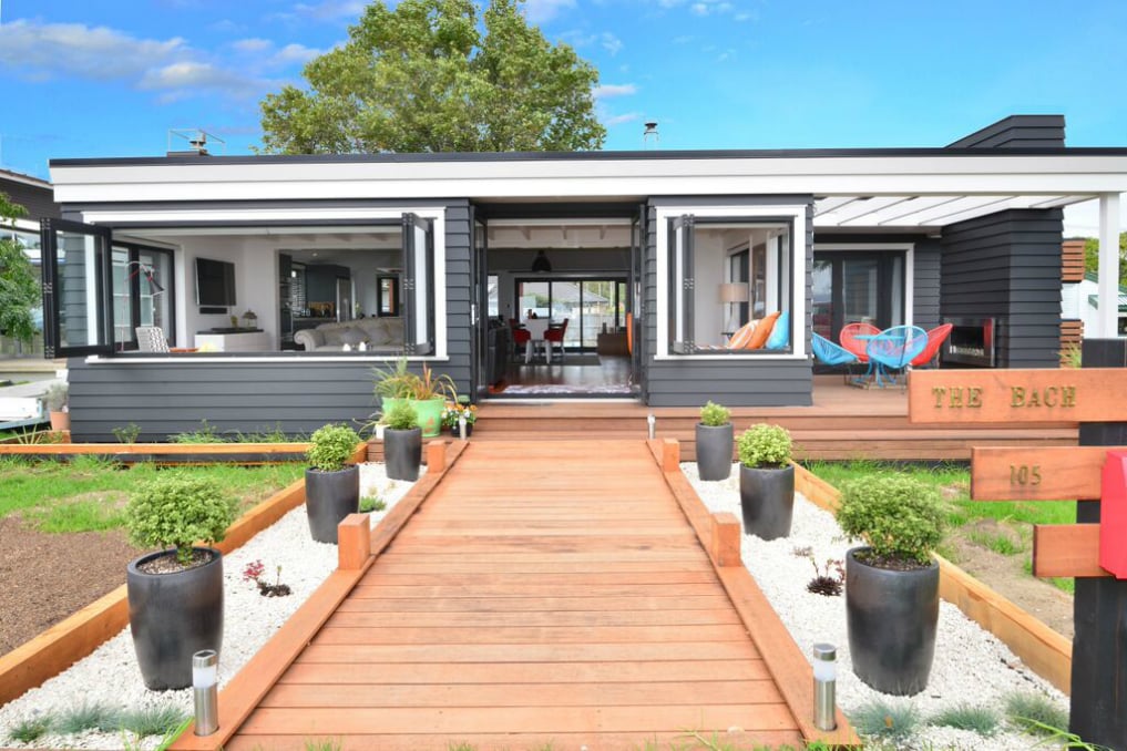
On a gentle slope overlooking Ligar Bay close to Abel Tasman National Park, three small, elegant, flat-roofed rectangular boxes sit lightly on the ground as if rolled to a gentle standstill.
Clad in weathered cedar and linked by timber pathways, or small bridges, traversing a planted landscape of native shrubs and ferns, they form an unassuming cluster of living spaces overlooking the treed slopes to the south, the green headlands to the east and west and, to the north, the vast sweep of Golden Bay out to the Tata Islands and Farewell Spit.
Within this stunning setting, the 178 square metre Ligar Bay house, originally designed as a bach for a family of four, comprises a large, one-bedroomed house with an open-plan living/dining/kitchen opening on to a covered open-ended outdoor living area; a smaller garage and workshop; and the separate guest annex (or children’s wing) with two bedrooms and ensuite, drinking in expansive views to the north.
“It’s a nice, practical way to lay out a house,” says architect Tony Karsten. “You are creating these sheltered areas between and around the buildings, and if guests come to stay they have their own private little wing. It is a bit like a commune, with a main building with a central dining room and a series of sleepouts or chalets around it – and you can always build more. With a bach you can do things like that – you can break the rules.”
The land was once the site of an old homestead, earmarked for a subdivision that never happened. Now, the three different-sized buildings, placed to follow the natural contour of the land, evoke the spirit of small-scale, beach-style shared housing with a central living space, a separate sleeping wing, and a separate garage integrated into, rather than dominating, the landscape.
“With any house on the hill, there’s no need to be two-storeyed. So, I have used this low-slung profile – I like those forms in rural areas. My idea of a Golden Bay bach is a house hidden in the trees.”
The seeming simplicity of these forms is achieved through the coherence of the design and the repeated rectangular forms and features. All are clad in vertical shiplap cedar weatherboards with windows recessed in white fiber cement sheet and roofs and joinery of Resene Ironsand, melding into the dense plantings of punga and manuka around the buildings. The interest lies in the extensive views – framed by narrow windows to the south and, in the main building, a huge 8 metre sliding door taking up two-thirds of the living/dining area’s northern wall.
Living and sleeping quarters have large, north-facing cantilevered decks floating at sitting height from the lawn with detailed edges mirroring exterior cladding. From the main house, the living/ entertainment area spills out onto an open-ended covered deck, forming an inviting sitting/dining area framing views to the north and the south yet protected from Golden Bay’s regular rainfall.
The interior of the main house is open, summery. There are few doors, relying instead on concise layout for privacy. Sloping ceilings of whitewashed pine ply, ply kitchen joinery and polished concrete flooring simplify the materiality and palette of living spaces, adding
a sense of spaciousness and lightness. A large concrete block fireplace with a raised unpolished hearth mirrors the building’s shape while also serving as a seat and a safety barrier for small children.
“I really like raised hearths, but they have to be quite big to make them worthwhile,” says Tony. “The unpolished concrete, sort of rough and ready, goes with the aesthetic of everything.”
In its careful configuration of indoor and outdoor spaces and the visual links connecting the different components, this Ligar Bay house, while contemporary in innovation, has a sense
of timelessness. Like the baches of the 1960s, it holds the promise of summer holidays, easy living, multi-generation use and the coming and goings of friends and family. But it also exemplifies an architectural ideal that works with, and fits into, the natural landscape with an unassuming – and not overly expensive – unpretentiousness.
“It is basically simple, nothing too precious. The linings aren’t expensive; the kitchen is ply. It is done on a budget. So, it isn’t glammy and glitzy, but it is a funky cool shape and it is robust.”
Photography Neil Smith
.jpg)

.jpg)
.jpg)
.jpg)
.jpg)


